

A Perfect Storm is Percolating
by Russell and Biggun

QQQ Fractal Resistance and Timing Analysis
The last two major reversals in the tech-led US equity market (July '24, Dec/Feb '25) both originated from the current QQQ 0.00%↑ symmetrical resistance zone encased by the yellow box ending at ~543.

Historical analysis shows the time-frame from peak resistance to the average % band at roughly 453 took 18 and 12 trading sessions for the July and February reversals respectively. Applying this pattern to the current peak on Wednesday June 11, we anticipate achievement of the 453 target by July 3rd-July 11th.
Cycle analysis reveals an average trough-trough cycle of 86 days. From the April 7 previous low, this implies the correction sequence continues "on average" until August 8th. The maximum trough-trough cycle length of roughly 156 days suggests a lasting sequence low will almost certainly occur prior to November 19th, including significant outlier sequences.
Volatility Index Cycles and Market Maker Regime Overthrow
Subscriber-exclusive analysis has identified a "quarterly vol cycle" formation on the VIX1D, implying mid-July to late-August will see a significant volatility event, commonly preceding temporary capitulation endings. Fractal comparisons with the 2008 equity reversal determined that lasting capitulation lows formed T+66 to T+84 days following initial dead-cat bottoms (July 30-August 25), with potential weakness for reversion around T+42 to T+60 days (June 5-July 2).
Amidst a zenith of retail and market maker complacency, we've confirmed a harrowing OMM regime shift: ceiling collapse regime on every daily expiry through June 19. In this specific Market Maker regime with excessively elevated ceilings, Market Makers actively unwind hedges against overpriced call options while put option decay remains comparatively muted. This creates net short imbalances where Market Makers passively net sell stock into market weakness—a mathematical necessity to maintain delta-neutral positioning across their option warehouse.The ceiling collapse limits upside exploration beyond previous day's highs while generating accelerating downside vulnerability day-over-day. The last regime shift of this caliber produced a 10% decline on the S&P 500 & NASDAQ 100 within weeks, ultimately extending to -20 & -25% declines over the following month. Using our tools at Fractal Exchange, we were able to anticipate this decline two days after the Nasdaq 100/ S&P 500 made their all-time-highs.
Confluence with Valuation Analysis
This technical deterioration aligns perfectly with fundamental valuation concerns that have been building throughout the current cycle. The combination of our time-based cycle analysis, volatility predictions, and market maker regime identification creates a compelling framework when viewed alongside traditional valuation metrics. The convergence of multiple analytical approaches—from fractal geometry and option flow dynamics to historical valuation benchmarks—suggests we're approaching a significant inflection point that extends beyond mere technical corrections.
Last week we showed that the broad US equity market was in a "topping cycle" Warren Buffett's favorite indicator available on this website:

Historically, the US equity market trading at the top of +2 std deviations has tended to pullback to various degrees. During the early 1960's through the late 1960's the market had more shallow pullbacks moving from +2 std devs down to +1 std dev and one time nearing the mean "Historical Trend Line". This technique is a measure of possible expansion in the underlying stock market. When the price of stocks is exceeding the economy's overall capability to expand, typically the P/E's are exceptionally overpriced and a pullback can follow as we have seen this week of June 9th through June 13th.
Russell’s Experience: Dot.Com Bubble Burst
I always keep an eye on this indicator to see where we are at in the overall Market Valuation to GDP. It is possible but extremely unlikely that we could exceed +2 std deviations in market valuation. During the Dot.Com Crash, I traded the reversal of +2 std devs; the result was vicious with the market continuing to melt down without respite as we can see by looking back on the graph (year 2000) was Dot.Com meltdown.
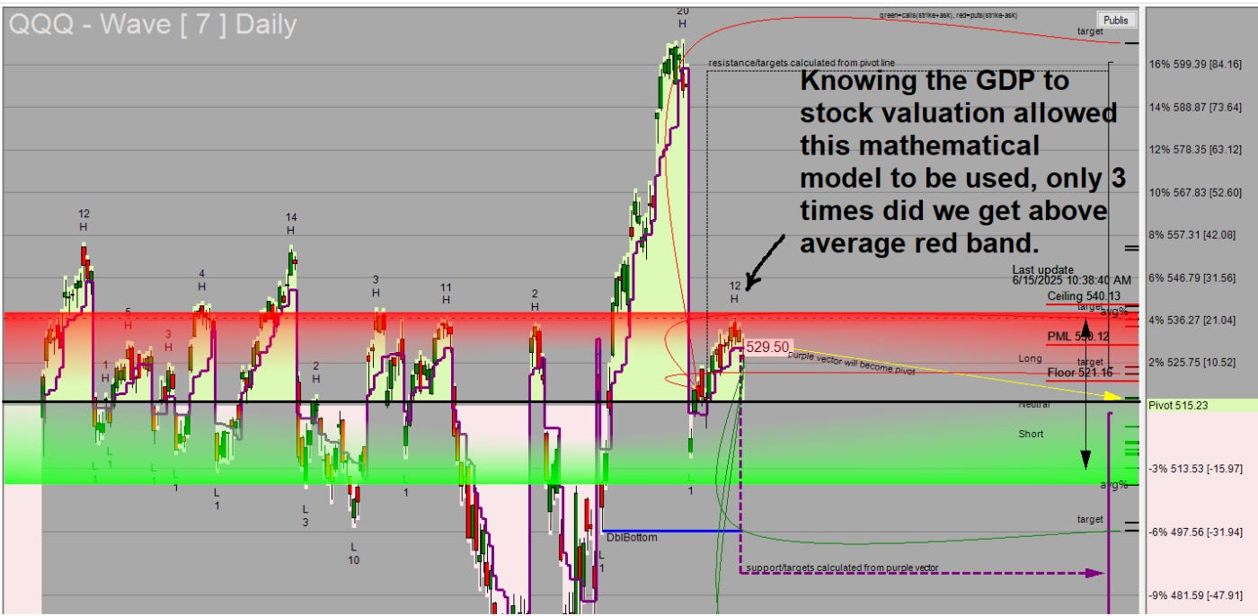
Knowing the information above, I was able to put into the QQQ Live stream this week the top of the red band with the statement that over 200 days only 3 times did we leave the top of the red band, which is the average top of the moves over 200 days.
Tragedy in the Making: Boeing
On June 9th I sent out BA 0.00%↑ at the 7H as shown. We were at the top of the average long move up and put side options were used to move back down to the average pullback. During this time, the Dreamliner tragedy occurred with the wreck in India, allowing the put side significantly more available upside than normally experienced.
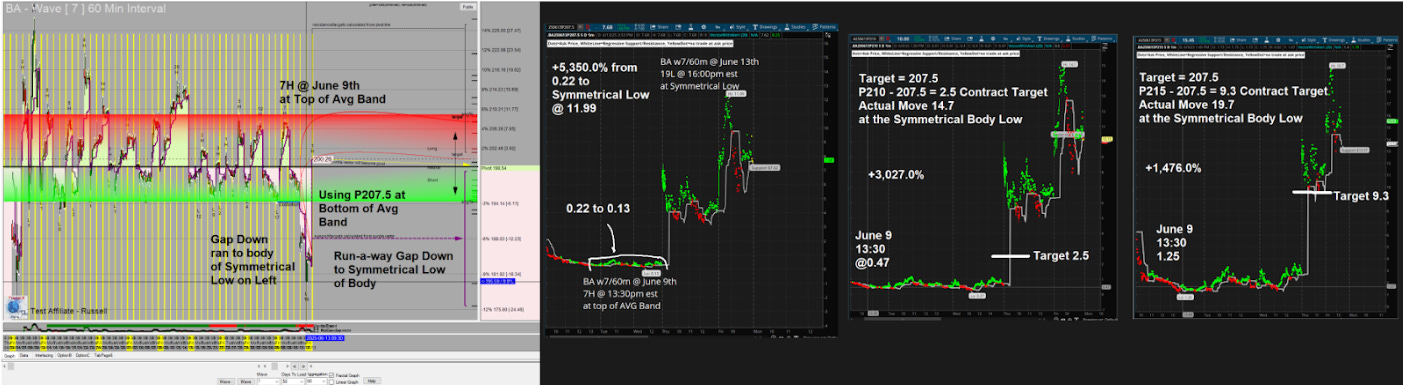
Approximately 207.5 was generally the mathematical average pullback experienced. However, with the crash of the Dreamliner, the stock gapped down underneath the average matching the left hand symmetrical body as shown running an outlier move This move allowed the puts various upsides from +5,350.0%, +3,027.0%, and finally +1,476.0%. I attached all 3 contracts that were within scope to use for the average pullback to show the various outcomes. This approach works the same way in all stocks & ETFs; when the average is violated to the short side or long side, the market uses past price moves as target areas for the short side price extension or long side price extension.
Something to watch in QQQ-Live
Here I'm going to illustrate this in SPX, but we did the exact same thing for QQQ during Friday, June 13th.
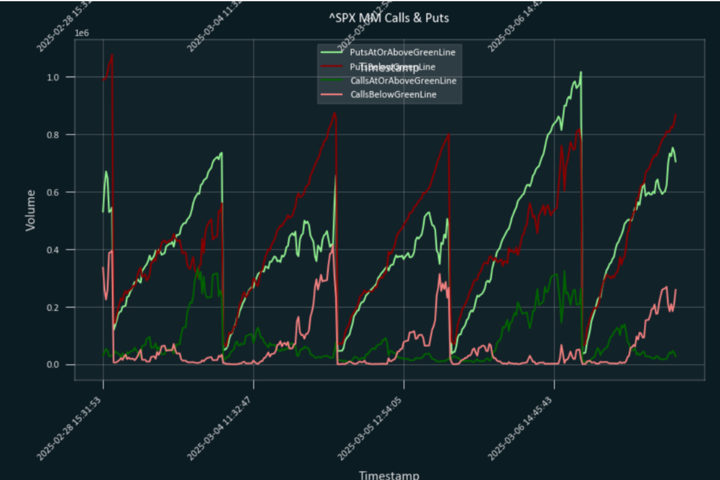
Above is our OMM volume graph that shows if a bull rally or bear rally is intact. The red line above is for bull rallies and the light green line above is for bear rallies. If red line is outpacing the light green line a bull rally is intact if the light green line is outpacing the red line then a bear rally is intact. Knowing this behavior on June 13th we were able to mark the "possible" intraday high in the QQQ ETF. We know historically that rallies tend to run to prior rallies high. I'll illustrate by putting some horizontal lines into that graph:

The market will try and seek out the past left hand rally peaks as shown. We do not know precisely where these peaks will occur in price; however, watching the OMM as the red line in this case above grows long, headed towards the last peak price, we can mark the price as we continue to head towards the last peak.
Using this approach for QQQ-Live on June 13th we were able to gauge approximately where the rally could stall out. This allowed a call side trade heading towards the peak and a put side trade away from that peak. Something to keep in mind going into this week of June 16th to June 20th and beyond.
Week of June 16
I don't have the exact stats in front of me but, over the years I've checked conflicts like this one with Israel/Iran and found that roughly, from when they start, its 1 to 3 trading days to a low- and there tends to be a bounce in the market; we will see if this repeats for this week or not. If so, that implies Monday/Tuesday June 16th or June 17th could be a bounce. Typically the bounce has lasted for a few trading days. As usual we will be watching our fractal geometry & OMM for any trade opportunities during this week.
Good Luck,
Russell